Tell a Story
As software engineers, we are constantly challenged to explain what we do and how we do it. This communication challenge becomes even more pronounced when we talk to non-technical stakeholders. Now that AI is enabling us to produce more than ever before, this problem has become even greater. But how do we effectively convey complex technical concepts to a non-technical audience?
A few years ago, I worked at the Port of Rotterdam. The office was located at the very end of the Kop van Zuid, giving us a stunning panoramic view of both the harbor and the city. Working from the 17th floor, the scenery was truly amazing. One of the most prominent landmarks you could see was the Erasmus Bridge, which connects the northern and southern parts of Rotterdam.
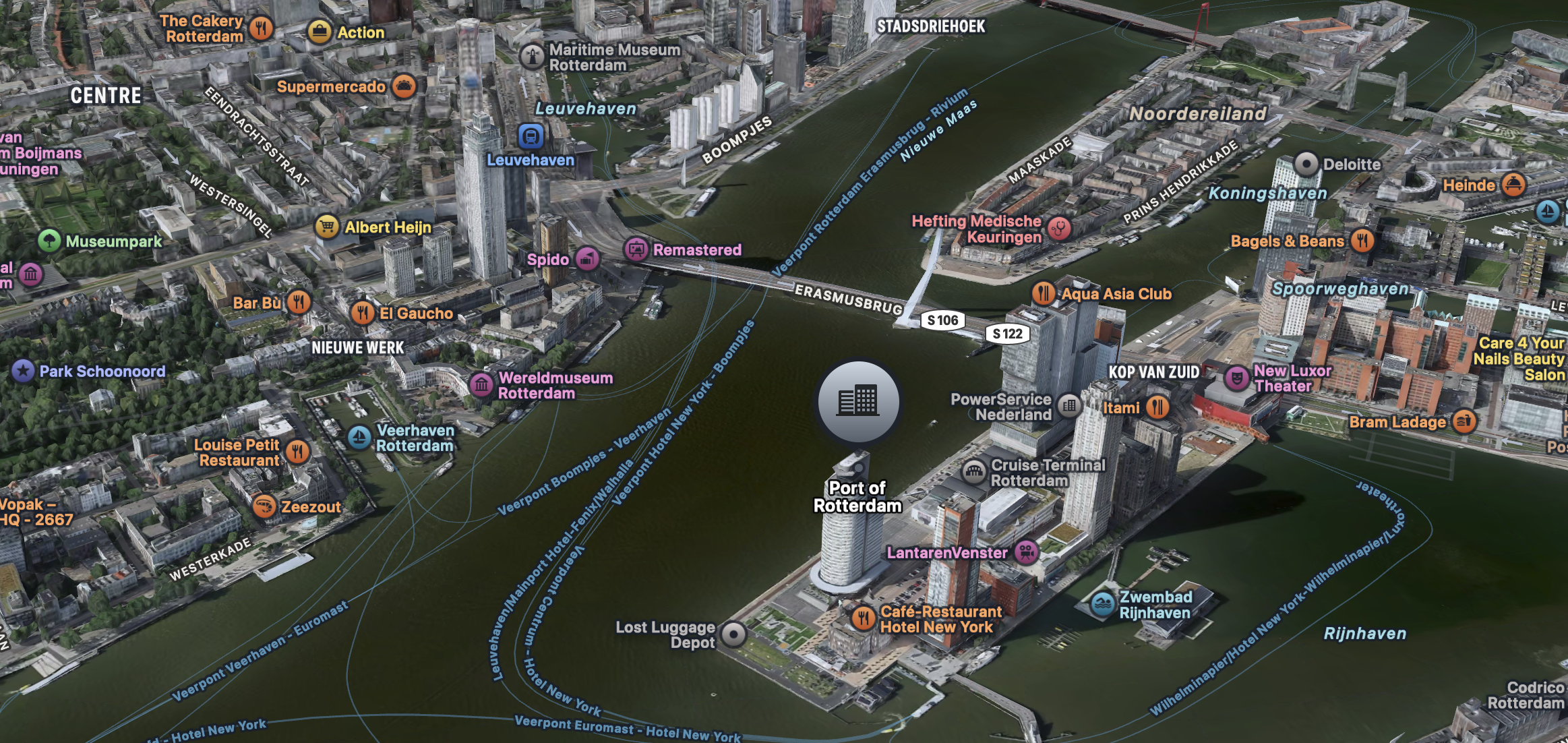
Every day, about 15,000 cyclists and 32,000 vehicles cross that bridge. When I went to get a coffee, I would often look out the window, watch the traffic flow, and wonder about the lives of all those commuters.
Every one of us is living our own story. Whether you lead a high-adventure life or prefer the comfort of being a stay-at-home type, everyone has something interesting to share. For some reason, we tend to hold those who lead bold, risky lives in higher regard than someone who prefers watching documentaries on the couch, although the latter might actually be much more fascinating to converse with. This is why I encourage everyone to share their stories, even if they think they are boring.
I firmly believe this is true, and this conviction goes further than you might think. It doesn’t just apply to our personal lives; I believe this "tell your story" principle is equally true for explaining concepts and data. To exchange information effectively, we must convey the why. This idea lies at the core of Simon Sinek’s "Golden Circle" theory[1], which asserts that people don’t buy what you do; they buy why you do it. The same logic applies to engineering: to get others on board, they must first understand your key motivation. To truly connect, the audience needs to do more than just hear the argument. They need to feel it.
But if every action is worth a story, how do we actually do it? First, start by slowing down. To share information, you must first internalize it. So, don’t rush straight into the narrative; first, let the data speak to you. Read it. Read it again. Ponder it. Contemplate it. Now, what do you feel?
|
"Feel the data?", you might say? "I don’t feel anything." It’s just a spreadsheet. A well-known paradigm. Some data record. Or maybe a boring AI article you had to read because a colleague kept bugging you about it."
|
The next step is to use this emotion to construct an allegory. This allegory will be the actual story you tell. Let’s look at a practical example. A few weeks ago, I was asked to explain why we should migrate a long-running application to a hexagonal architecture. This app had been under active development for years, continuously evolving with new features while deprecating old ones. Naturally, over time, the architecture had grown increasingly complex and messy. If you are a developer, you probably started listing the technical arguments in your head the moment you read that. But let’s go back to the first step. Don’t rush into the arguments yet. Start with the feeling. In this case, it’s simple: you feel uneasy about the messy state of the current codebase, but you imagine absolute bliss once the re-architecture is complete.
Next, we need an allegory. After thinking for a bit, the advice "Clean up your room" from Jordan Peterson’s book 12 Rules for Life came to mind. It was the perfect metaphor: the rule emphasizes cleaning and organizing your immediate environment before taking on new challenges. That is exactly why we need to perform a proper re-architecture before adding more features!
The next step is to tell the story. Often, the best approach is to gather your stakeholders, book a room, and share the narrative. A good story should stand on its own, so don’t hesitate to set the scene before diving into the hard facts. For example, imagine you have to present a spreadsheet containing rather discouraging metrics; definitely not the easiest task. When sharing the report, you could start by saying something like:
"This is the performance report for the last 90 days. To be honest, the results are quite sobering. It’s like walking for too long in a desert. For a short while, you’re fine because you brought some water. But once your supplies are spent, you need to find an oasis to keep going. We’ve passed some minor watering holes, but a significant, sustainable oasis is not yet in sight. We need to act. Let me walk you through the details."
In just a few sentences, you describe a project that had initial resources but must now find a sustainable way forward. Your audience will grasp the situation immediately. The story makes the situation easier to digest and gives everyone a moment to breathe before looking at the details. The first time you tell a story like this, it might feel a little awkward, but I guarantee it gets easier over time!
If you still feel hesitant, you can also turn your story into an image. After all, a picture is worth a thousand words. With today’s AI tools, generating these visuals is incredibly easy. For our hexagonal architecture example, I created this image[2]:

While creating great visuals is a broad topic beyond the scope of this post, here is a useful tip: always consider your audience and the context. An informal, in-house presentation is very different from an official whitepaper. As a rule of thumb, the more formal the setting, the less you should rely on AI generation (notice the hallucinated changing windows in the example image). Make sure to choose a style that fits the occasion.
So to summarize:
-
Slow down: Identify what you feel about the topic you need to present.
-
Turn the emotion into an allegory: Find a relatable metaphor.
-
Share the story: Set the scene before presenting the data.
Good luck!
